Burndown Charts Got You Down? Meet Your Helpful Alternative – Burnup Chart
Burndown charts are bad! Burndown charts are abused by mangers! We hate Burndown charts (and estimates!!), so let’s get rid of them all! If you are hearing those words, or something similar, from the fire eaters in your office, they are probably right.
While I like Burndown charts, they are not always the best choice for a Team. This is most true when a Burndown chart has been used in the past to micromanage the Team, punish people for making “bad estimates” or give the idea of progress, yet not single line of code is demonstrated. If this describes your situation, might I suggest offering the your Team and Stakeholders a different visualization? – a Burnup chart.
Wait?!….So why is a Burnup chart any better? In reality, one is no worse than the other since they essentially show the same information – estimated work completed over time. However, a Burnup chart has three key advantages over a Burndown chart. One, it is much harder to game since people are unfamiliar with its format and structure. Two, a Burnup shows progress towards a goal, rather conformance to specific plan of execution. Three, some things look better going up rather than going down.
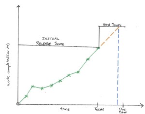 Burnup Chart
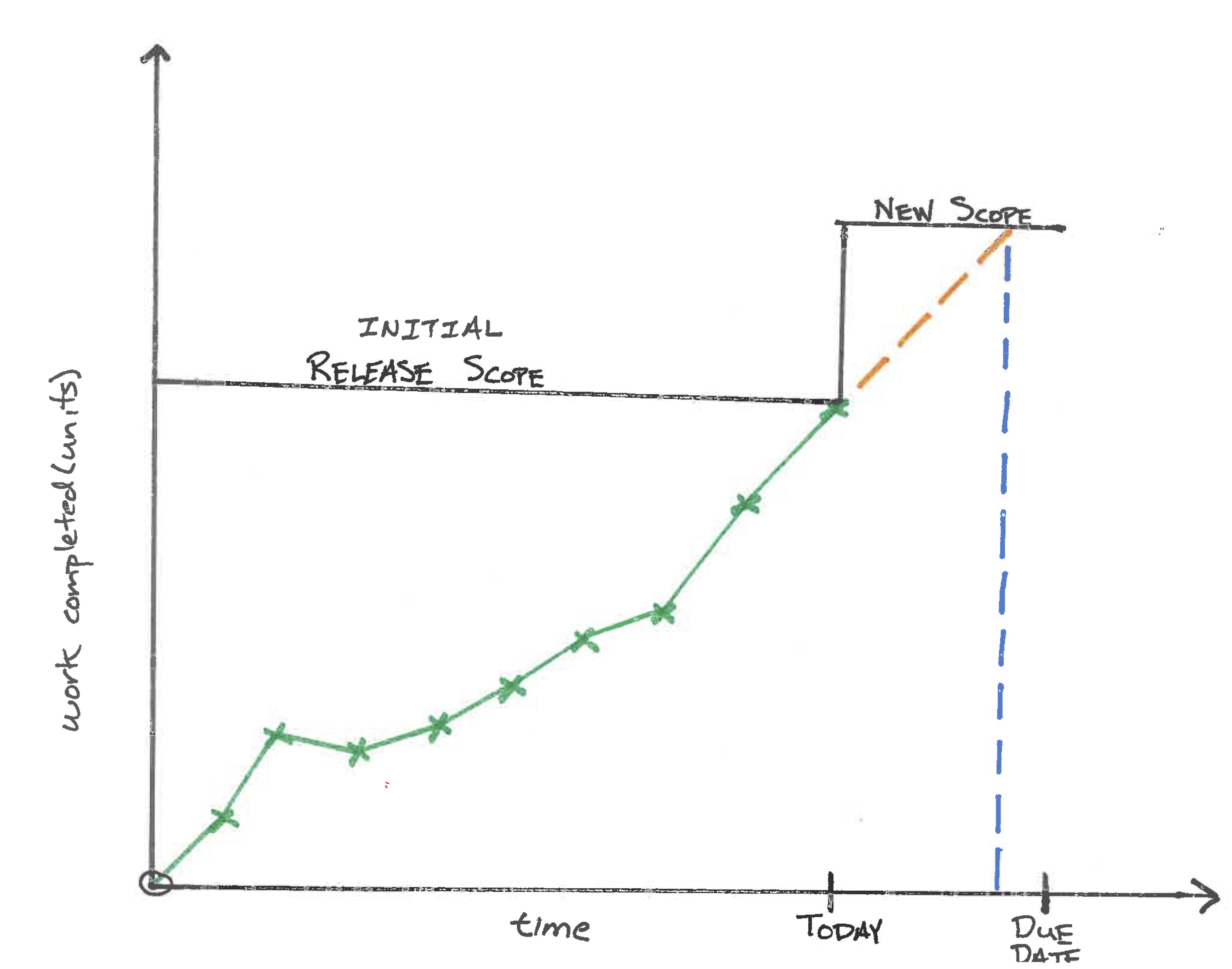
Purpose: show incremental progress of work completed and provide greater visibility when scope is added.
Variations: none
Audience: team members, managers, Product Owners, ScrumMasters, stakeholders, senior leaders.
How to use: at the beginning of the release, the team comes up with an initial list of work items they are going to complete and presents a sum of all the estimates. Where this initial value intersects the y-axis, a horizontal, black line is drawn and labeled as “initial release scope”. The black line ends at the due date for the project. At regular intervals, the team provides an update of the work completed (the green x’s) and the green line represents their actual progress. Ideally, the end of the green line should meet the end of the black line at the end of the project.
This diagram makes the addition of new scope quite obvious. On today’s date, the stakeholders decided to increase the scope of the release, labeled as “new scope”, yet did not extend the deadline. Will the team complete the new scope before the due date? With this diagram, we can begin to answer that question.
The orange line represents the linear projection of the team’s current rate of progress into the future. Where the orange line crosses the black “new scope” line is the forecasted completion date for the team when projected back to the x-axis (the blue, dashed line), given their rate of completion remains the same. In the diagram, the orange lines informs us, as of today, the team is expected to complete the work before the agreed upon due date. If this were not the case, then some sort of countermeasure would have needed to be taken in order to meet the original due date – bring on additional teams (if there is time) or reduce scope so that the projection of the orange line crosses the x-axis at the due date.
Please keep in mind, the way this diagram is used is quite similar to the Burndown Chart. Consider reaching for this tool when you find the Burndown Charts are causing more confusion or concealing the addition of new scope.
When not to use: for short periods of time less than four weeks or when scope is expected to change less than 10% to 20% for the duration of the project.