The Much Maligned, but Every Useful Burndown Chart
In Scrum, the best way to show progress is through working software. If you do not produce software at the end of each Sprint, you are doing it wrong. Progress is not shown through reports, documents, screenshots or charts.
So what about a Burndown chart? Can’t someone look at the Burndown chart and see what is done? Unfortunately, the answer is “yes” and “no”. In my Certified ScrumMaster courses, I regularly remind people that Burndown charts should rarely be shown outside the Team. Once people outside the Team see a Burndown chart, it normally invites micromanagement and “helpful” suggestions from outside the Team on how to improve. That is a clear case for a “no”.
Due to the long abuse by management and misunderstanding by practitioners, Burndown charts are falling out of favor in the Scrum community. You might be surprised, but I was strongly against Burndown charts when I worked as an internal Agile coach at a big San Diego biotech. At the time (2007 or so), I argued quite forcefully against Burndown charts since they were used to punish teams. I changed my mind when a colleague, Matin Orono, told me, “That is sad you believe that. It [a Burndown chart] is just a tool. You should not eliminate a tool just because some people use it incorrectly.”
Martin was right then and he is right today – eliminating Burndown charts because of their misuse is sad. IMO, burndown charts are quite helpful for Teams and we should not eliminate them from Scrum because bad managers use them incorrectly. IME, an accurate Burndown chart can serve as a powerful data point on the health of a Sprint. When used properly, a Burndown chart can tell if the Team is on-track or off-track on the delivery of their Sprint Goal. Anything that helps a Scrum Team deliver is something we should say “yes” to.
This article today is the beginning of a series of six articles on simple visual controls and simple reporting tools I have used that have been helpful for Scrum Teams. The purpose of these articles is to give Scrum practitioners new ideas and techniques get a sense of what is going on with a Scrum Team, visualize the complex and how progress with simple tools. I hope you enjoy this series!
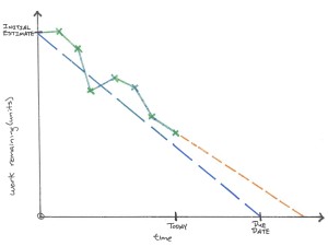 Burndown Chart
Purpose: show incremental progress of work remaining, provide visibility on the true state of progress and allow team members to make adjustments in order to meet their deadlines.
Variations: Sprint Burndown, Product Burndown
Audience: team members, managers, ScrumMasters, Product Owners, stakeholders who regularly interact with the team
How to use: at the beginning of an iteration (or release), the team comes up with an initial list of work items they are going to complete and presents a sum of all the estimates. This value is placed on y-axis as the “initial value”. Next, a straight line (the dashed, blue line) is drawn connecting the initial value with the due date – this represents the ideal rate work would be completed if an equal amount of work was completed each day. At regular intervals, the team provides an update of the work remaining (the green x’s). As new work emerges, the work is estimated and added to the chart on the day it was discovered.
The green line represents the actual progress of the team. When the green line is below the blue line, the team is completing work faster than the ideal rate. When the lines are reversed, green above blue, the team is completing work slower than the ideal rate. There can be numerous reasons why a team may be completing work faster, or slower, than the ideal rate and this chart does not provide any of those answers. What the chart does provide is a snapshot of the real progress of the team in order to ask the question, “Are we going to complete all the work we committed to by the due date?”
Finally, the orange line represents the linear projection of the team’s current rate of progress into the future. Where the orange line crosses the x-axis is the forecasted completion date for the team, if their rate of completion remains the same. In the diagram, the orange lines informs us, as of today, the team is expected to complete the work after the agreed upon due date. As a result, some sort of countermeasure will need to be taken in order to meet the original due date – bring on additional teams (if there is time) or reduce scope so that the projection of the orange line crosses the x-axis at the due date.
When not to use: for time periods greater than six months, when the work items are difficult to estimate in advance or the flow of work is extremely variable.