When Will You Be Done? The Release Burndown Chart
The work will get done when it gets done. Demanding that a new product, service or upgrade be completed by January 23, 2016 is just not helpful. Arbitrary deadlines simply cause too much stress and anguish for everyone – developers, customers and managers. The people doing the work spend long hours away from their family to hit an unattainable goal, mangers and senior leaders accept unnecessary stress to deliver on an objective that no one believes in and customers suffer from poor quality and substandard products.
I understand that businesses need to get a handle on delivery dates since customers, users and partners need to know when to be ready to receive the new product. Yet, our track record of delivering a fixed scope, fixed date with a fixed budget is awful. Too much changes in software development to accept this as a precondition. As an industry, we need to recognize that our pattern of making commitments up front and hoping that we magically hit some mythical date needs to change.
Rather than aiming our cannon at a stationary target and anticipate we hit the bullseye, our goal should be to steer the project towards success stepwise. If we have our destination in mind and bring our customer along as a passenger, then to nudge, urge or alter course every two weeks would not be that hard. In order to do that successfully, we need to know how we are doing against the original scope and that is where a Release burndown chart comes in handy. For more on Release Burndown charts, check out this 2010 article.
 Release Burndown Chart

Purpose: show incremental progress of scope completed and provide greater visibility when scope is added.
Variations: none
Audience: line managers, Product Owners, ScrumMasters, stakeholders, senior leaders.
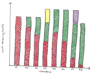
How to use: at the beginning of the release, the team comes up with an initial list of work items they are going to complete and presents a sum of all the estimates. At the end of every iteration, the team provides an update of how much scope was completed. In the diagram of a date-driven release divided into eight equally-sized iterations, this is represented by the green blocks, while the red blocks represent the unfinished scope.
When new scope is added in iteration #4, it is indicated by a yellow block. As a result, the total height of the bar goes up showing scope has increased for this project. In iteration #5, we see the height of the red block increases to denote the new (unfinished) scope.
Like the Burndown and Burnup Charts, we use linear projections to see if the team is going to complete the scope by the due date (in this case by the close of Iteration #8). In Iterations #1 to #4, the team was making good progress, perhaps even finishing early. However, the addition of new scope in Iteration #4 has altered the picture. If we were to draw a straight line connecting the centerpoints of the red block tops of Iteration #5 and #6, we would see the project completing some time after Iteration #8.
Consequently, in Iteration #7 scope was removed from the project (represented by the purple block). Removed scope is normally taken from the unfinished scope, which is why the height of the red block decreases in Iteration #7. Also note the total scope delivered at the end of Iteration #8 was less than what was originally committed to during Iteration #1 and some scope remains unfinished at the close. Depending on a number of circumstances – business needs, client relationship, contractual obligations – this may, or may not, be acceptable.
When not to use: for projects where the majority of the work is exploratory or when scope additions, or subtractions, exceed 50% of the initial estimates.